These are all SOOOO beautiful!!!! Wow!
On the “His” and “Hers” cocktails…. I think maybe the “Hers” and “His” need to have a little space between the word and the cocktail so it’s more defined? Also, it’s a little hard to read “Tinis.” What about switching the font of “Teensy’s Tinis” and espresso maritini? Would that look good?
Of course, these are just ideas… it looks AMAZING!
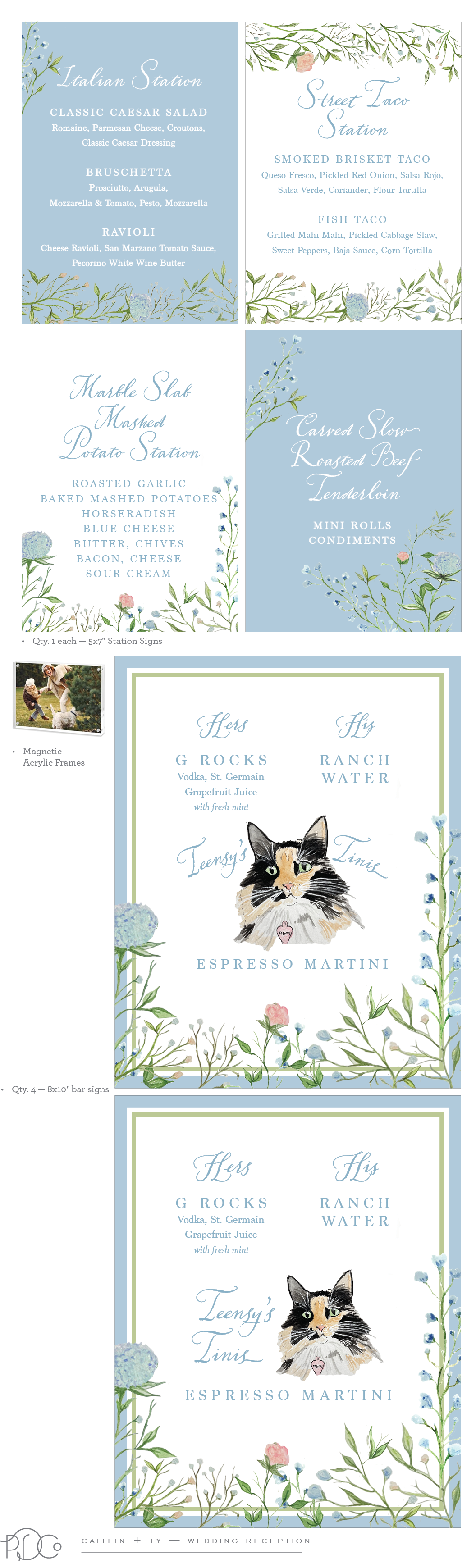
GORGEOUS!!!!!
I’ll get back w/ you shortly on Sunday Brunch…
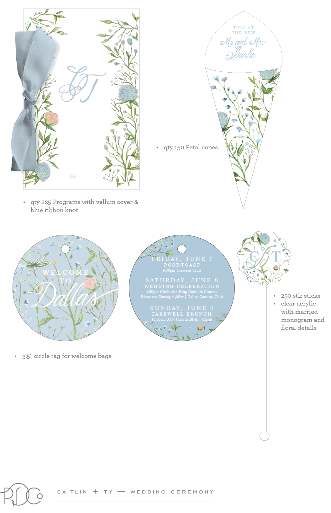
What about the Welcome Tag being a little bigger? 3.5”?
Looks awesome!! Love it!
These are all SOOOO beautiful!!!! Wow!
On the “His” and “Hers” cocktails…. I think maybe the “Hers” and “His” need to have a little space between the word and the cocktail so it’s more defined? Also, it’s a little hard to read “Tinis.” What about switching the font of “Teensy’s Tinis” and espresso maritini? Would that look good?
Of course, these are just ideas… it looks AMAZING!
I think the original bar sign works the best, didn’t work to bring the title up & together over the cat’s ears. Let me know which one is the winner!
I love the first bar sign
Great! Let’s do the first one!